In the world of finance, complexity often reigns supreme. But what if we could make investing as straightforward as a game of Connect Four? That's exactly the challenge we tackled in our recent rebranding project for Boring Investment, a platform dedicated to simplifying the path to financial health.
From Concept to Visual Details
Our goal was clear: create a brand identity that conveys security, approachability, and clarity. We designed a user experience that reflects core values of simplicity, optimism, and professionalism. Here's how we brought these ideas to life:
1. The Power of Green
We chose green as the primary color, inspired by optimism and growth. It's a visual reminder that investing can be a clear, accessible experience that helps savings grow safely and strategically.
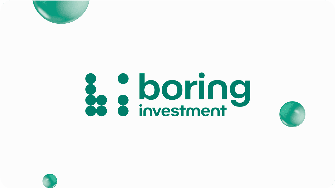
2. A Logo with Purpose
Drawing inspiration from the diversification logic of Connect Four, we created a logo using circles in a grid to represent diverse investments. This structure not only forms the brand's initials "b" and "i" but also connects identity and purpose in a single, memorable symbol.
3. Modern, Simple Typography
To strike the right tone - professional yet accessible - we selected a typeface that creates trust for those seeking an easy way to invest.
The Impact of Authentic Branding
This project allowed us to explore the power of authentic branding in finance. By focusing on clarity and accessibility, we've helped convey that investing is a smart, achievable decision for everyone. The true goal? Helping hardworking individuals take control of their savings with a clear, safe strategy.
In the end, if we can make people feel secure and confident about their financial journey, we know we're on the right track. Because sometimes, the most boring investment can lead to the most exciting future.